
How Anticipatory Design
Boosts Parents Retention
Role: UX/UI Designer
Process: Design Sprint
Duration: 1 week
Design Tool: Figma, FigJam
TinyTales is a new startup where authors and illustrators can publish children’s stories for parents to read to their kids. They have a library of short stories, Illustrated books, educational stories for children and tons of other books and stories made for parents to read aloud to their children.
As TinyTales expand their library stories, parents have expressed that finding the right stories to read to their children has been difficult and time consuming.
We began the design sprint by mapping out all of the data and insights provided by the research team. Then, to prioritize those insights and discover significant themes, we created an affinity map.
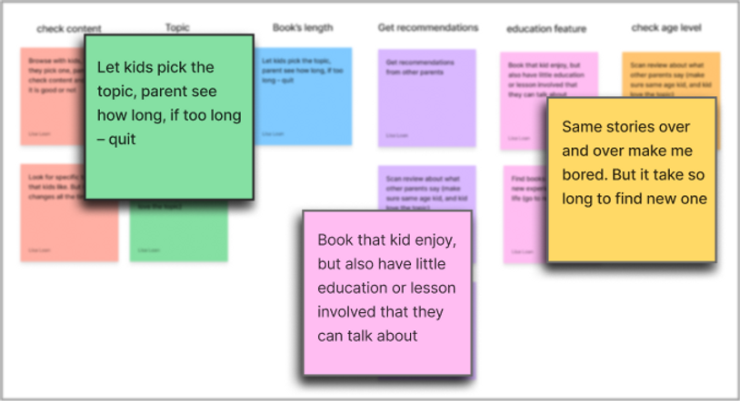
Let kids pick the topic, parent see how long, if too long - quit
"Books that kid enjoy, but also have little education or lesson involved that they can talk about"
"Same stories over and over make me bored. But it take so long to find new one"
Meet Lauren, our user persona, who has two children: James, 6, and Kayla, 3.
Lauren values reading time with her children because she understands it allows them to use their imaginations and learn new things.
Lauren, on the other hand, frequently spends more time looking for a story than reading it. She becomes frustrated. Some books are age appropriate, but they are too long or do not cover the topics her children are interested in. Some books lack educational content or learning points that her kids can benefit from.
.

Photo by Jhon David on Unsplash
so...
How might we design an experience that allows Lauren to spend less time looking while still having great books for her children?
To kick off brainstorming session, we looked at a marketplace to see how our book apps are working today. We found that there are two ways for users to discover content that interests them:
1. Search for a specific term/item
(using tags, categories, horizontal carousel, search bars, filters)
(using tags, categories, profile of preferences, top rated, trending, featured content, recommended by app, recommended by people, timeline to refresh)
2. Browse for something new

.png)
Little Stories
We came to the realization that even after searching or browsing, parents still need to take some time to find books in a long list.
Therefore, we wonder...

Why don't we use anticipatory design to speed up the process of finding and searching for parents?
"Anticipatory Design ensures that users can find what they need or make decisions faster, saving them time and allowing them to do more."
- UX 24/7

The idea of a surprise bag was born after brainstorming so many solutions.
Instead of making parents browse through categories and filter stuff out, each weeks TinyTales could offer the family five books using anticipatory design.
The books' surprising reveal as a present would be exciting for children and delivering only five books would avoid decision paralysis for parents.
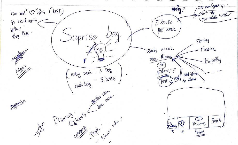
A rough user flow was made to determine the critical path that users will take when using TinyTales

Sketching
Thinking aloud on paper allows everyone—myself and my team—to see how ideas begin, evolve, and finally crystallize into the solution we've all been working toward.
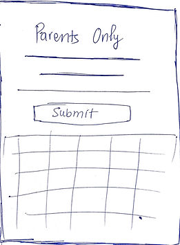
Ensure that only the parents have access to the app
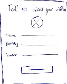
Collecting data to get meaningful time-saver

Greeting children with a surprise box/bag
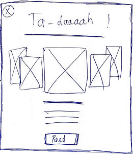
The books have vital information that parents need to know
Prototyping
From our solution sketch, we prototyped our design in Figma.


The colors, fonts, and proportions of items were adjusted so they were interesting and easy enough for kids and parents alike to navigate


The animation transitions were made smooth but fun and engaging for kids
User Testing
Five participants who were as close to Lauren as possible were chosen for moderated usability tests. They all have had prior experience reading to children.
Parent
Parent
Parent/Teacher
Nanny
Teacher
TinyTales was tested in person by two people using an iPad. The other three were on separate Zoom calls, navigating a Figma prototype on their laptops.
2 in-person tests
3 remote tests
Of all the insights we got, Jenny's feedback stuck us the most.
"Are there enough information to recommend appropriate books for children? I think that age and gender are insufficient"
- Jenny
Successful anticipatory design requires the designer to truly understand the user. The insight from Jenny was very helpful. Revision on that was top priority.

Outcome
Overall people enjoyed the design prototype! They liked the playfulness, surprising reading box and color scheme. The featured lessons tags for each story were appreciated by many of the participants since they let them know what educational values that would be covered.
Next Steps
Should this app be further developed, we would:
- Research and design more questions or quizzes to better understand user (children) characteristics
- Create a more detailed usability test with users on the prototype
- Extend the app to include the user's bookstore
Further Questions
- What privacy issues do we need to be aware of?
- How would we ensure this app becomes a habitual part of parents and kids life?
- How would we make this app financially sustainable?
- How do we grow the user base?
Thank you for sticking with me until the end of my case study!